Last week, LabourList noticed a new Twitter account: @LabourDesign. Amid tweets celebrating contemporary and vintage graphic design related to the Labour Party, much of it made by party activists, the account holder also indicated that a new collective of artists and designers had formed. Excited by the project, we got in touch with LPGD and spoke to founder Kevin Kennedy Ryan…
How did you come up with the idea of starting Labour Party Graphic Designers?
The idea was born of out a desire to connect designers and creatives within the Labour Party. In a party of hundreds of thousands, it’s inevitable that there are some wonderfully talented, creative people – but until now there hasn’t been a way to bring them together. That’s what LPGD aims to do.
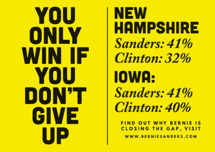
I first had the idea during the 2016 Democratic primaries. I was living in Chicago and involved with a wing of the Sanders campaign called ‘Design For Bernie’: a collection of artists, designers and creatives who had offered to volunteer their labour to create original pieces of artwork that would add vibrancy to the campaign.
In a similar way to the Sanders campaign, our movement is built from its grassroots – we don’t have the wealth and media ownership of the Tories. In the struggle to create a better world, we must excite and engage the talents of our members. I hope that others will be inspired to use their skillsets and interests as a way of building support for the Labour Party and winning the next general election. In a phrase: they have the cash and we have the culture.
Design is also a great unifier within the party – with the internal divisions we’ve seen over recent decades, good art is something everyone can get behind.
What are the aims of the project?
We want to create a network of designers and other creatives in the party. By making a space where creatives can interact with each other, we hope these connections can lead to innovative ideas and art.
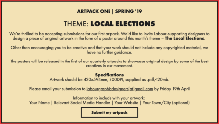
At the same time, LPGD will exist to celebrate the best in art and design from our movement, both past and present. Part of this entails creating a catalogue of historic designs, but also being able to share new artwork produced by supporters of the party. Today, we’ve launched the first of many quarterly art packs, with ‘local elections’ as the theme.
What’s an “art pack”?
In short, it’s a call to action for designers in the party and part of our strategy to create inspiring original artwork in the labour movement. We are inviting submissions from designers around a central theme, to be sent to us before Friday 19th April. We’ll then publish successful submissions online as a collection of posters.
How many people are involved? Is there a committee?
We currently have an organising group of roughly a dozen people, but we’ve had hundreds of talented designers follow us on Twitter. Everything is quite informal at the moment, but we’re looking to involve as many people as possible in the future.
What are your three favourite examples of Labour design?
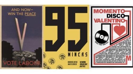
My personal favourite is this poster from the 1945 election. The clean typeface is beautiful. To me, the poster encapsulates the history of our movement. That anyone knocking on doors, stuffing envelopes, attending meetings and, in LPGD’s case, designing posters, is one of millions of people over the last century who have given their time and effort to changing the world for the better. The message of the poster is as relevant in 2019 as it was in 1945. Our tactics and actions may have changed but our beliefs and our motivations remain the same.
This poster from 1966 comes a close second because it represents an important step forward in the development of the party’s visual communications from David Kingsley. And these posters by FHK Henrion in the 1960s have to take third place. A rarely-seen set commissioned by the late, great Tony Benn, they were one of the first examples of design we posted on the LPGD Twitter account.
Vintage Labour posters commissioned by Tony Benn (1960s) pic.twitter.com/6mi4ZgvEf9
— Labour Party Graphic Designers (@LabourDesign) March 25, 2019
‘Swiss style’ seems to be all the rage among Labour designers now. What other styles are you seeing used often? Do you favour a particular style?
Swiss style is great – led by typography and a grid-based layout, I think it makes for a very accessible style for designers with a good understanding of type and colour, but who may not be so gifted at illustration. Speaking personally, as someone who is not an illustrator by any means, I spend a lot of time trying to get around the fact that I can’t draw.
As for favouring a particular style, I’m a huge fan of situationist art. Any art that represents a millenarian spirit of change has huge cultural significance and artistic value: the connection between the situationist movement and the events of May 1968 in Paris; the marriage between the art, the slogans and its anonymised posters produced some of the most impactful political art of the 20th century.
In terms of design trends within the party, the move away from Neo Sans has been incredibly welcome!

Do you have any other long-term plans?
The immediate focus is on the first art pack, along with getting a full version of our website online. Once developed further, it will include creating a directory of Labour-supporting designers.
Working on strategies to engage and connect designers is a big priority for us. We’re looking at a potential meet-up event in the summer, along with early discussions about how we may be able to host events at or around conference.
How can people get involved?
Slide into our DMs over at @LabourDesign on Twitter, email us [email protected] or get in touch through our website at labourdesign.co.uk.




More from LabourList
Government to drop security services exemption from Hillsborough Law
Scottish Labour ‘best choice to stop SNP’ in two-thirds of Scottish seats
‘Marginal gains’