For many involved in the midterms, the work has finished. The ballot papers have been counted, the elections declared and the banners taken down. But for some, the end of polling day is just the beginning. Not just for those elected to Congress, but those here in the UK, too. Yesterday, grassroots group Momentum announced they would study the campaign of Beto O’Rourke, the punk-turned-politician who narrowly lost his Texas Senate fight against incumbent Ted Cruz.
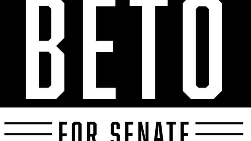
While the campaign was impressive for its ground work – knocking on 2.8 million doors and making over 20 million phone calls – it was also notable for its unique design. Most US political campaigns follow a simple red and blue format, a nod to the primary colours of the two main parties, but Beto’s campaign eschewed colour altogether, opting for a simple, stark black and white logo.
Tony Casas, the designer of Beto’s campaign logo, tells me the stark colours were chosen because “Beto rides center on most issues and I really wanted to focus on a bi-partisan design that didn’t lead voters to look left or right.”
Where often political campaigns focus on highlighting the party over an individual candidate, Beto’s campaign tried to bring fresh ideas to a tired format. “I wanted to create something using a palette that no-one had really seen before, making him stand out in a sea of yard-signs and campaign-filled media.”
The design for Beto’s logo is simple, yet bold. Mixing what Tony calls “traditional punk rock colours” with a bold, sans-serif typeface – Abolition by Mattox Shuler – the meaning is, says Tony, as straightforward as it could be: “I am Beto and I am running for Senate.”
Tony’s concept also allows for interpretation in the form of “unofficial” designs. Images ranging from Obama ‘Hope’-style posters to Kennedy ‘A Time for Greatness’-inspired event posters served to spread the message state-wide that positive change was possible. In some ways, it was this flexibility that made the Beto logo a success.
Democratising design in grassroots campaigns, in much the same way Labour did in its 2017 general election campaign, provides a platform for political expression unmatched by expensive, corporate campaigns.
There are few metrics to prove the theory, but on social media sites where posts by friends are now prioritised over posts from organisations, democratised design takes centre stage. As party activist and CEO of digital engagement agency Wilder Digital Tom Lillywhite wrote in his review of Labour’s digital campaign, this can create a “de-centralised campaign where the power of people as content creators and content sharers [is] absolutely key”.
Tony says he believes “each and every little piece anyone took the time to do made more of a difference than anyone really understands”. Much like organising your own event for your CLP, designing a political image can empower supporters. It personalises politics and the candidates themselves, which is something grassroots campaigns should seize with both hands. The vast array of “unofficial” content created for Labour’s 2017 campaign proves the model can already work in the UK – but we can improve further still by learning from what they’re doing across the pond.
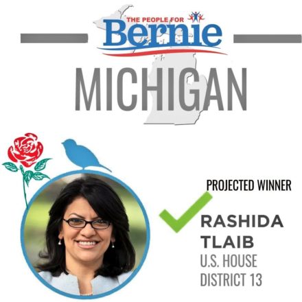
Sharing is a two-way street, of course. As Unite activist and LabourList columnist Shelly Asquith highlighted yesterday, grassroots collective People4Bernie have been using the 1997 Labour rose to highlight Democratic candidates who are also members of the Democratic Socialists of America (DSA). Asked about their use of the British logo, the group said it was to show “solidarity across the global, modern socialist movement”. People4Bernie told me they used our old Labour rose, along with the bird (a nod to “Birdie Sanders”), to create “powerful imagery”. It worked.
Returning to Beto’s senate run, Tony Casas particularly appreciated that the candidate gave him “100% free rein”. Tony tells me: “He really trusted me, cut me loose, and let me come up with anything that I thought would fit his campaign. With his feedback, as well as the support of the campaign, I am extremely proud of the product that was released into the world.”
While Beto didn’t win, he came within just 200,000 votes in a state that hasn’t been represented by a Democrat since 1994. For Momentum, there is much to learn from Beto’s grassroots campaign; for political designers on the left, there is perhaps even more.
James Calmus is a Labour activist and graphic designer.

More from LabourList
Sarwar: ‘Humza Yousaf’s leadership is in tailspin. The time for change has come’
Haigh: We won’t shut ticket offices or cut jobs – or nationalise water
Lou Haigh to reveal ‘roadmap’ for public ownership of railways within first term