
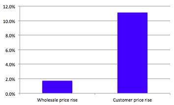
Over at the New Statesman this morning, George Eaton reports on the disparity between the rise in wholesale energy costs and the rise in how much customers are getting charged by their energy companies – (1.7% wholesale rise vs 11.1% consumer cost hike).
Or – to put it another way – the energy companies are taking you for a ride. Here’s two charts that show just how much. First up – that comparison between wholesale and consumer price rises over the past year according to OFGEM:
So the energy companies aren’t “passing on the cost to the consumer – they’re passing on much more than that. And just to prove it, here’s the difference between the average profit made on a household bill last year, compared to this year (again, according to OFGEM):
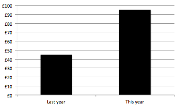
At a time when people are facing a huge squeeze on their finances, the average energy company is more than doubling their profits on the average bill. It’s 35 days since Ed Miliband announced plans for a price freeze – David Cameron is still yet to do anything other than talk vaguely about green taxes…

More from LabourList
Which Labour MPs are backing to Burnham become the party’s next leader and Prime Minister?
‘While leaders change, Labour endures’
Labour MPs and activists welcome Burnham apology for party’s initial response to Gaza conflict