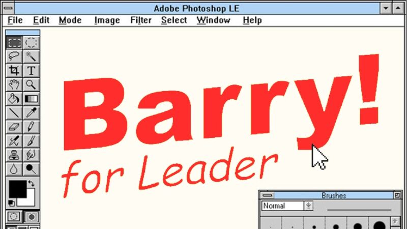
The Labour leadership election started approximately 48 years ago and nothing much has happened to change its dynamics in the meantime. Fresh off the back of a general election we’d rather not talk about, the party committed itself to another bout of hot polling action to decide on a new leader (and deputy). Names were bandied around, hats were thrown in the general direction of the ring, some stepped forward, some withdrew, and all the while we never got a look at a Barry Gardiner for Leader logo.
With a general election campaign so near in the rear view mirror, candidates should be forgiven for having a somewhat sketchy start in putting together their all-important visual identities. While some of us might work from graphic design backwards, it turns out serious politicians tend to focus on policies rather than pixels.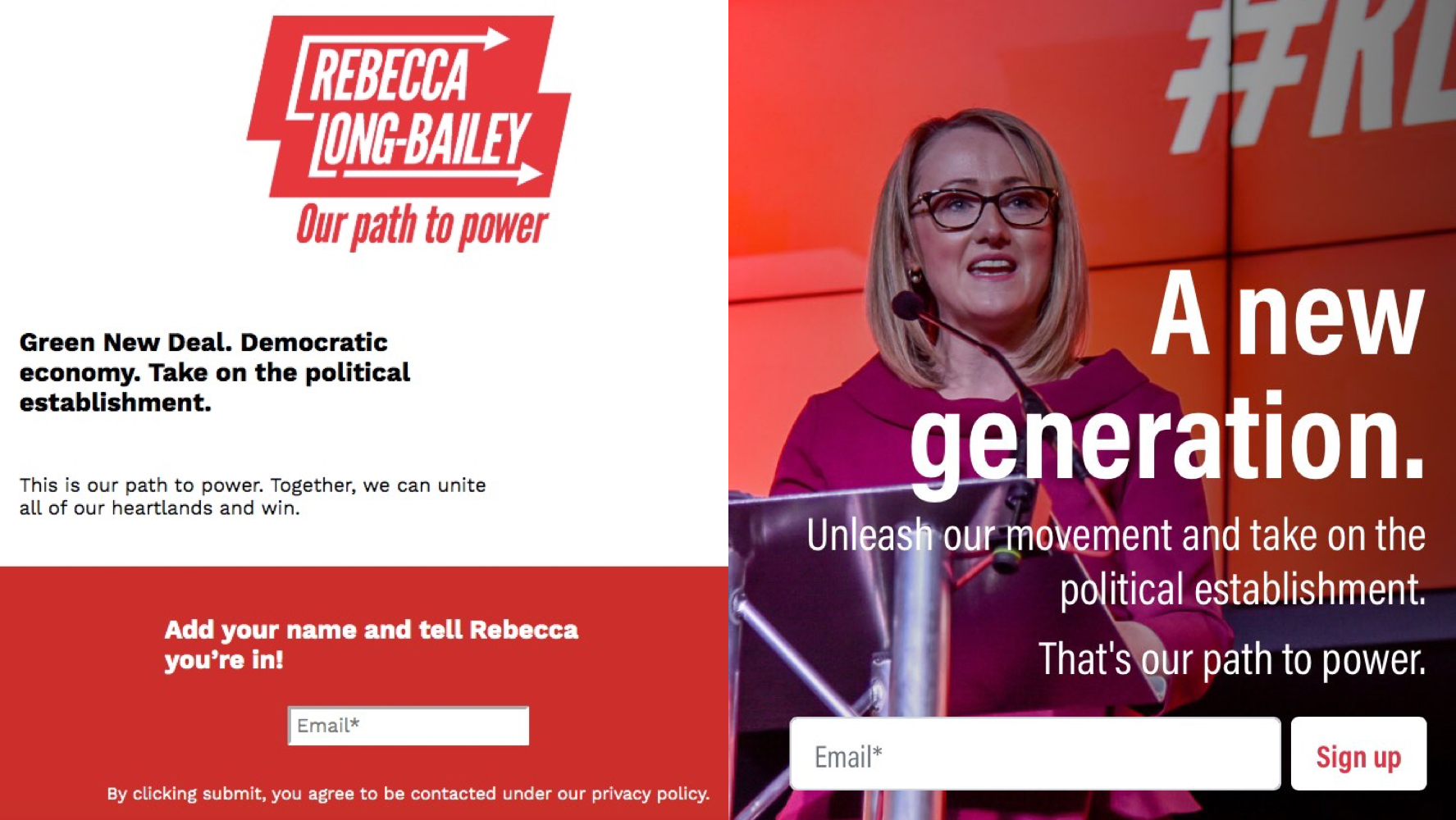
Several candidates saw a visual overhaul of their campaigns between the launch and the beginning of voting – compare Rebecca Long-Bailey first website to her redesigned one, as shown above, or Angela Rayner’s initial design to her current brand. This is fair enough, really. Preparing for a leadership election shouldn’t have been at the top of anyone’s to do list before December 12th.
The deputy leadership candidates
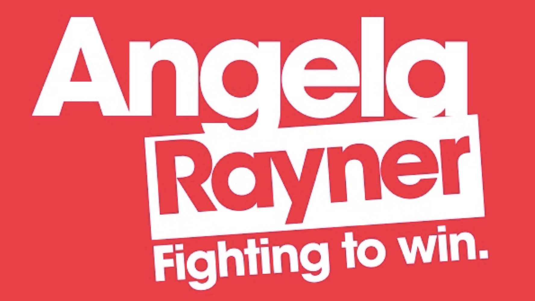
Angela Rayner
Tightly kerned in ITC Avant Garde, Rayner’s campaign opted for continuity with some of her material from the general election campaign, using the same typeface and colour palette. We’ll call this one Old Trusty.
Maximum degrees of rotation: 2.5°
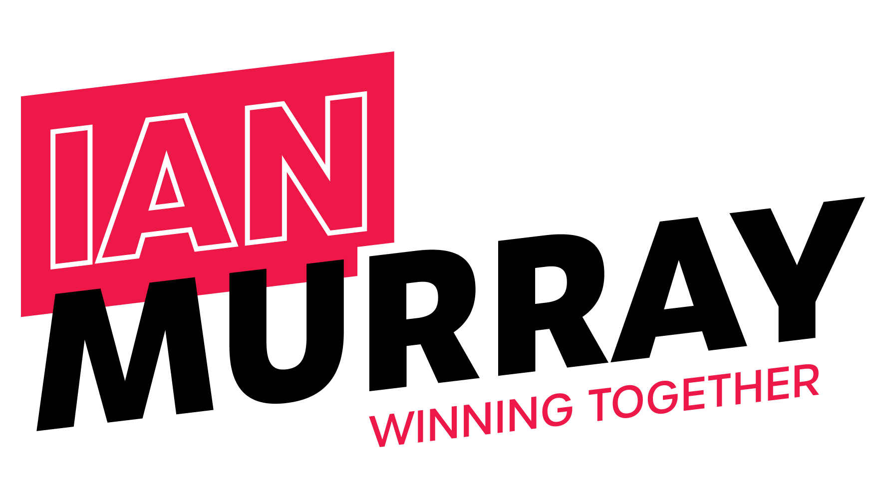
Ian Murray
Picking up on a trend of shearing and rotating a typographic logo, Murray opts for all caps for impact, backed up by a punchy magenta box housing ‘Ian’. Straying away from various hues of Labour-red is a welcome respite, while emphasising ‘Ian’ in the box and de-emphasising it with an outline leaves you wondering where exactly to focus your attention.
Maximum degrees of rotation: 7°
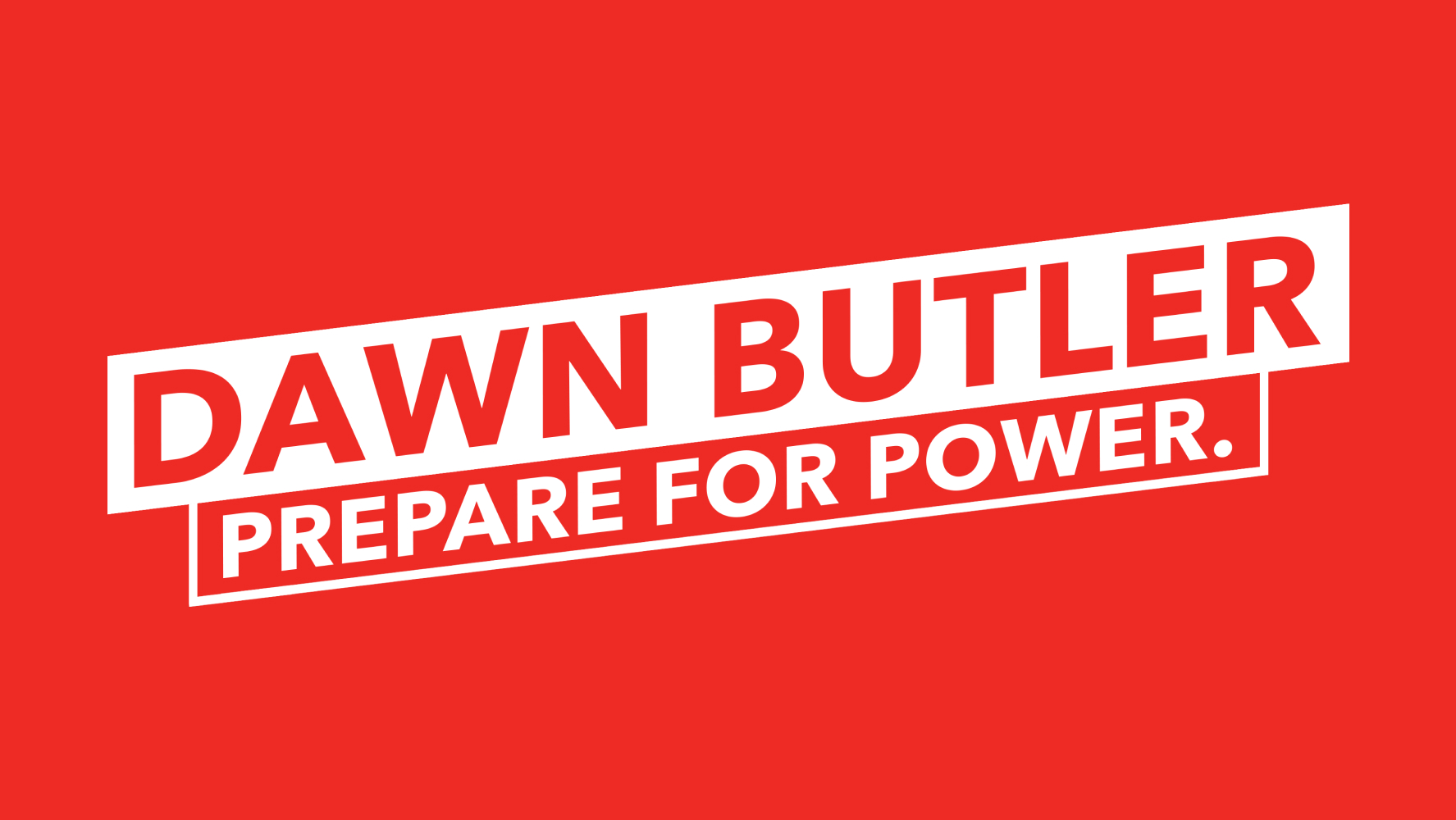
Dawn Butler
A not-terribly-distinctive logo from a candidate who could have released one of the more vibrant campaign designs.
Maximum degrees of rotation: 6°
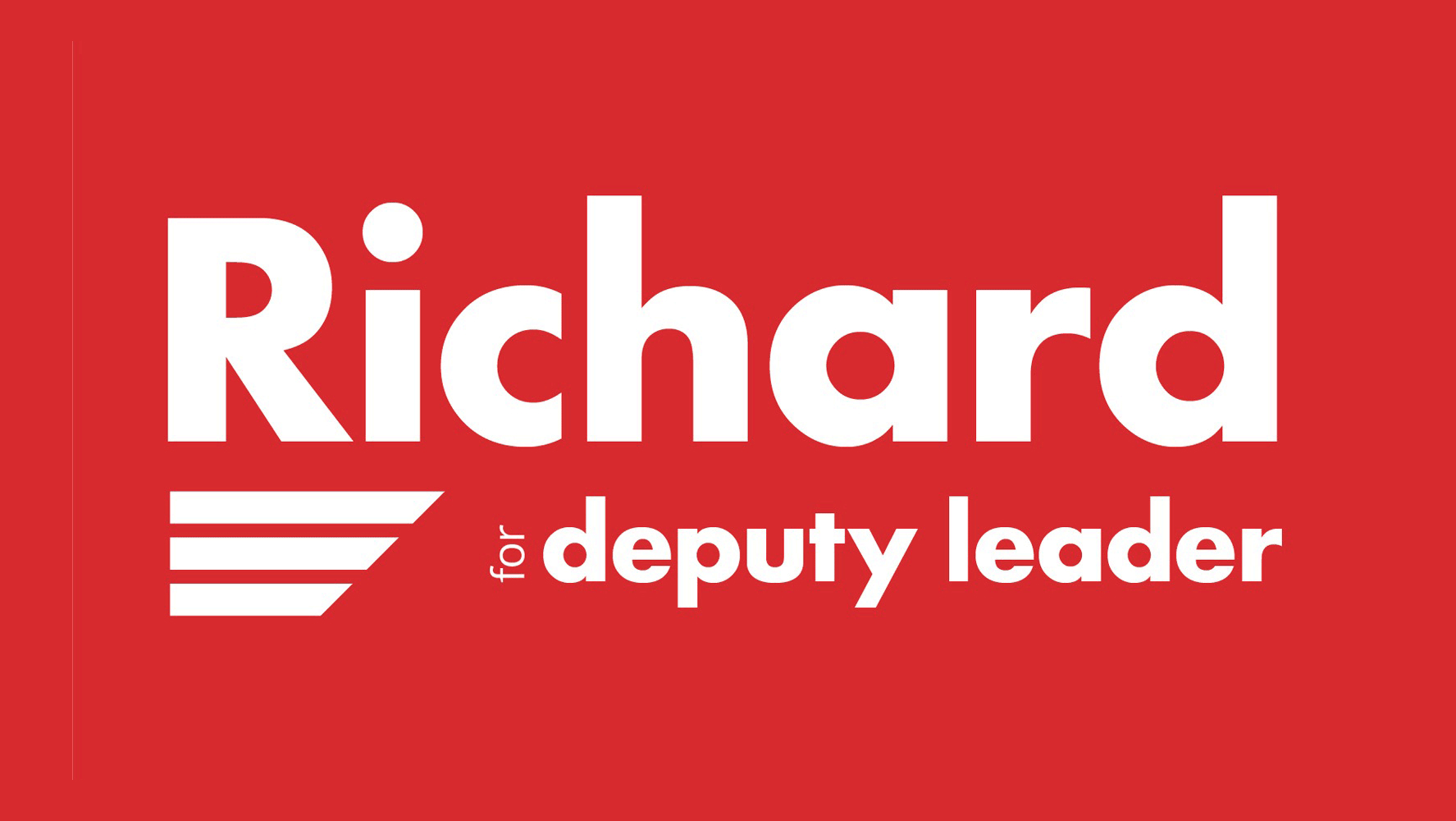
Richard Burgon
Informal vibes coming from Camp Richard. They have eschewed the formality of a surname and gone for a simple typographic lockup in Futura, once described by Aaron Draplin as “the working man’s font”. Loses points for not including his surname, as if Richard Burgon were Ronaldo or Trisha.
Maximum degrees of rotation: none, but check out the angle on those three stripes.
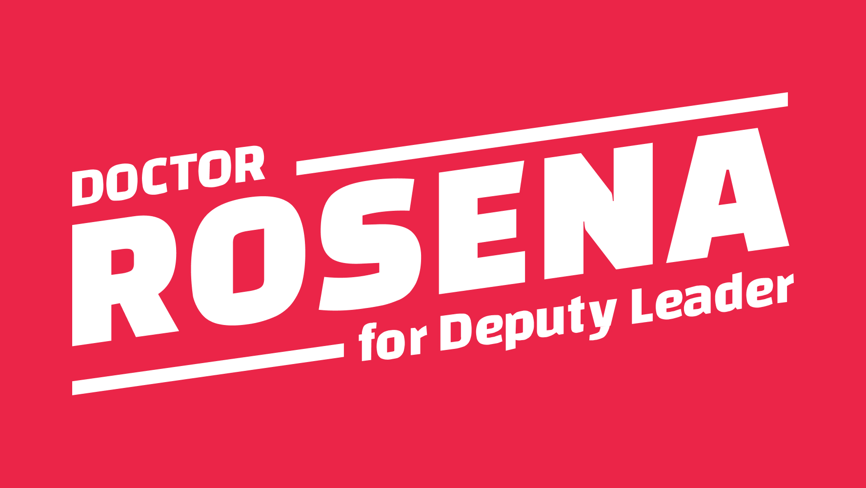
Rosena Allin-Khan
It was always inevitable that we’d get at least one AOC spin-off in the election. While not quite as vibrant as its forerunner, fortunately this one is much more pleasantly executed than some of the examples we saw in the election.
Maximum degrees of rotation: 7°
Khalid Mahmood
Did Khalid Mahmood ever have a logo? That’s a question right up there with who shot JFK?
Maximum degrees of rotation: we may never know.
The leadership candidates
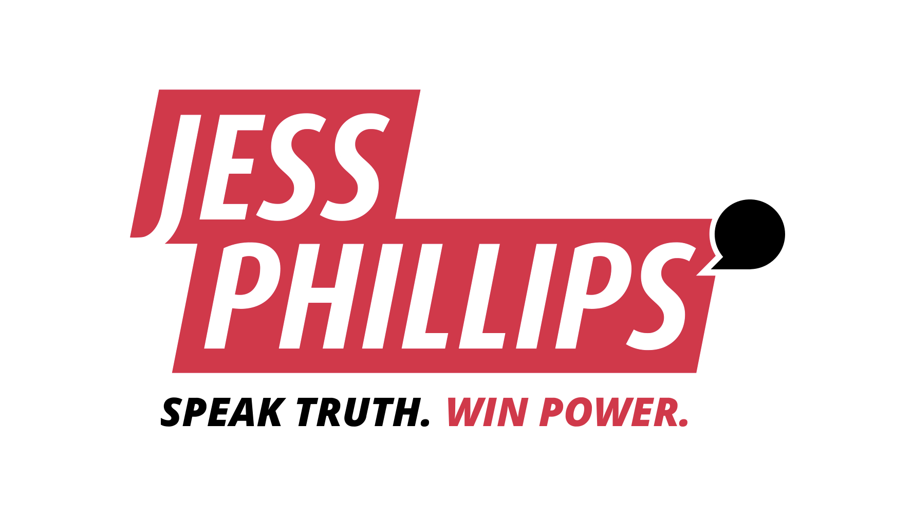
Jess Phillips
Not a lot to be said other than a relatively slick effort from Jess Phillips. Hats off to the team at Portland Communications*.
Maximum degrees of rotation: zero.
*This is a joke, please don’t sue.
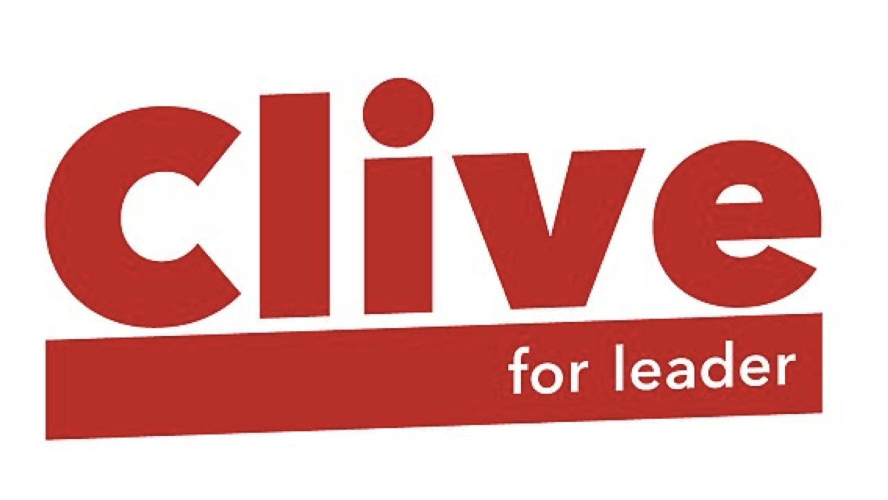
Clive Lewis
Channeling Big Richard Energy, Clive opted for a punchy, informal typographic lockup. The kerning is a bit off and it feels a little unbalanced, but it had the potential to evolve had Clive’s campaign continued to the later stages of the contest.
Maximum degrees of rotation: 2°
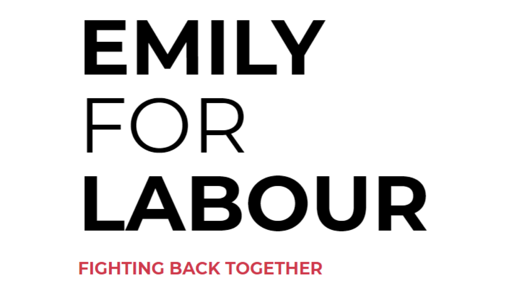
Emily Thornberry
Bold-Light-Bold is a well trodden typographic cliche in the Labour Party. Thornberry’s logo was reminiscent of the Make Poverty History campaign (for anyone old enough to remember 2008, when we could all still go outside), as she rejected the anticipated red in favour of a minimalist colour palette with subtle magenta highlighting on the strapline. The strapline is a bit too small.
Maximum degrees of rotation: zero
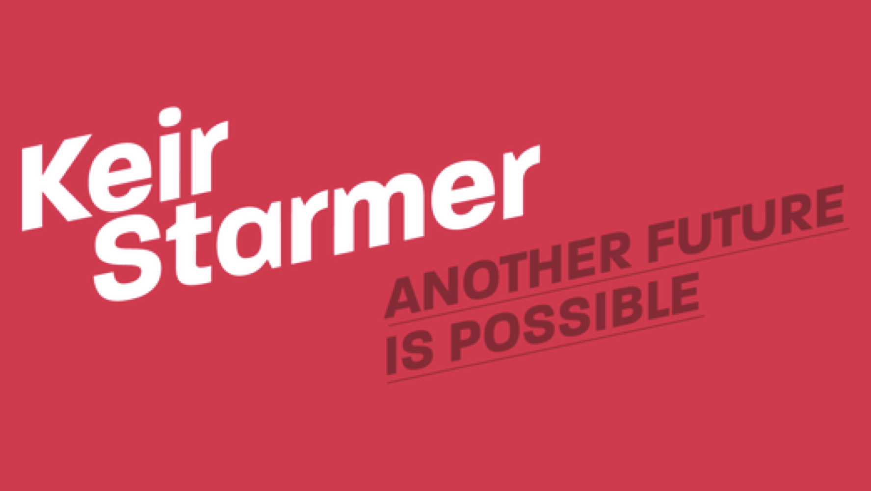
Keir Starmer
The Steepest Incline of Any Candidate Logo Award goes to Sir Keir Starmer KCB QC. He deserves some credit here for being one of the few candidates to push the envelope with a pink and dark colour scheme on his website. Also Steep Incline sounds like the name of a West Country village that has returned a Tory MP every election since 1832.
Maximum degrees of rotation: 12°
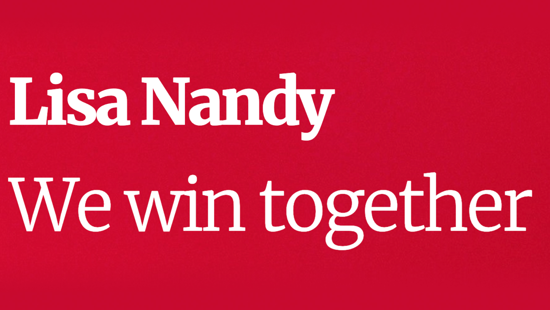
Lisa Nandy
The only candidate to employ a serif typeface – something rarely seen in the party since the ’90s. Is this a subtle nod towards the early Blair years? Probably not. Is it the New Statesman font? Yep.
Maximum degrees of rotation: none
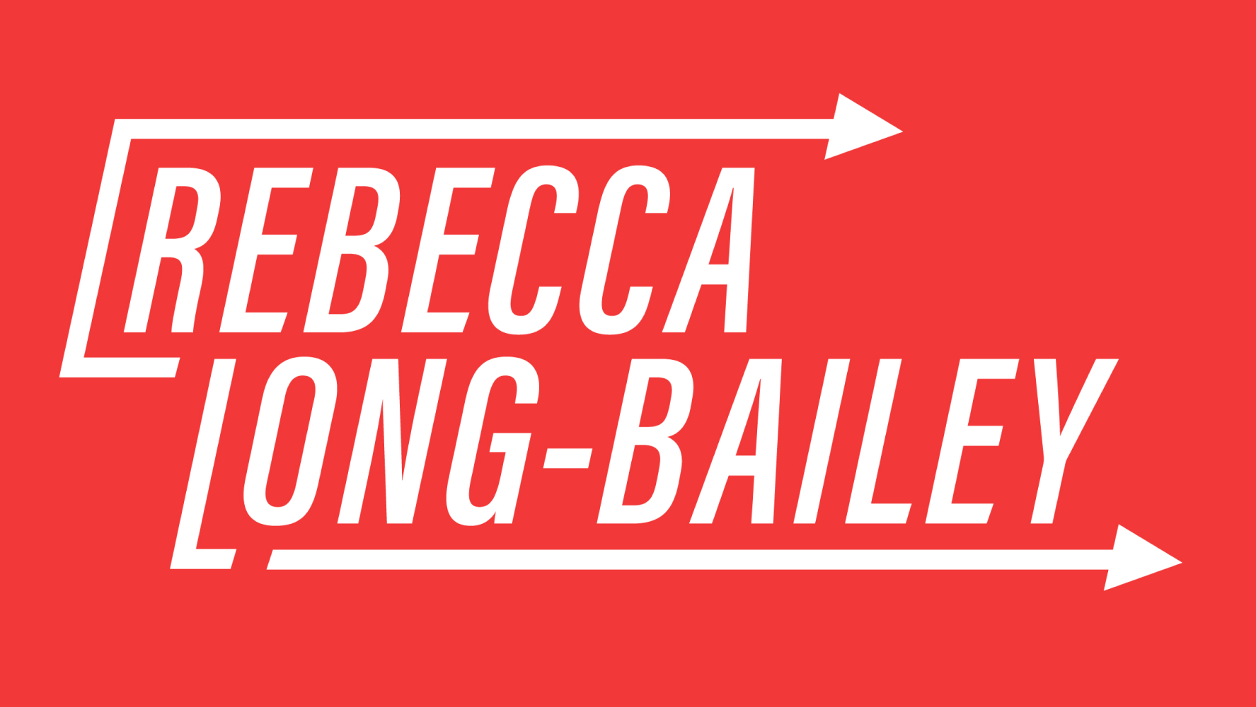
Rebecca Long-Bailey
One of the more distinctive logos of the election goes to Rebecca Long-Bailey, incorporating the forward arrow motif to represent progress.
Maximum degrees of rotation: zero, but a couple of corners
That’s a wrap, unless anyone wants to leak us the Khalid Mahmood and Barry Gardiner logos. Had the contest come less hurriedly off the back of a general election, perhaps we would have seen some more exploration from candidates into divergent visual identities.
By largely staying close to traditional labour colours, no candidate has come out with designs beyond what we might expect. Safe, reliable, trustworthy, Labour – these are the core messages being conveyed. We’ll have to wait and see whether the next leader to be will take the party’s visual identity in a more radical direction.

More from LabourList
Which Labour MPs are backing to Burnham become the party’s next leader and Prime Minister?
‘While leaders change, Labour endures’
Labour MPs and activists welcome Burnham apology for party’s initial response to Gaza conflict