Much excitement earlier today when the Scottish Conservatives unveiled their new logo – a kind of Union flag-coloured saltire, with blue being rather more prominent than the red.
I think it’s rather effective, to be honest.
And the thought occurred (not for the first time, it has to be said): should Scottish Labour get itself a new logo?
 It’s such an obvious move that I don’t doubt that those at the top of the party have at least already considered it. Who knows? The unveiling might be closer than we think.
Obviously logos are, to an extent, superficial; a good logo is no substitute for values, policies and leadership. But at the same time, good policies, values and leadership might be made that more effective with a corporate identity that interests and even engages the target audience.
“Corporate” logos have taken on huge importance in the last 25 years or so. Time was when a party’s logo didn’t really matter, or was rarely even used on local literature. The SNP’s familiar… what do you call it…. twirly thing is one of the best known political symbols in the land; they were mad to try to re-design it back in 1991 and wise to revert to the familiar… er, twirly thing.
![]() The Scottish Parliament’s “logo” is a great example of why competitions should never be used to identify corporate designs. They seem like a great idea at the time to the chief executive, chairman or Presiding Officer of the organisation in question: “This will involve ordinary people, make them feel part of the new venture, democratise our image, etc.” And it will also be cheap. David Steel made the mistake of launching such a competition among design students, and the result is the rather clumsy, amateurish and cheap-looking “marque”, with inelegant swathes of dark blue all over the place and a St Andrew’s flag dropped unsubtly in the middle of it.
The Scottish Parliament’s “logo” is a great example of why competitions should never be used to identify corporate designs. They seem like a great idea at the time to the chief executive, chairman or Presiding Officer of the organisation in question: “This will involve ordinary people, make them feel part of the new venture, democratise our image, etc.” And it will also be cheap. David Steel made the mistake of launching such a competition among design students, and the result is the rather clumsy, amateurish and cheap-looking “marque”, with inelegant swathes of dark blue all over the place and a St Andrew’s flag dropped unsubtly in the middle of it.
So here’s the thing: if you want a professional, attractive, adaptable and instantly recognisable logo, pay an agency to come up with one. Which is what the Scottish Tories seem to have done.
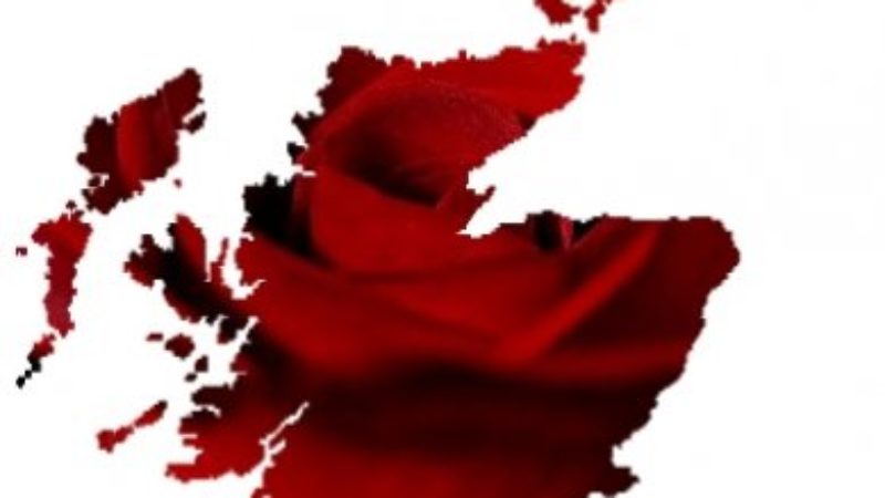
Labour, under Neil Kinnock and the guidance of our then Director of Communications, Peter Mandelson, ditched the short-lived “flag” logo which had been used extensively during the disastrous 1983 campaign and in 1986 came up instead with the now well-established (though since evolved) “rose” logo. In Scotland there was the inevitable whinging about the rose being a symbol of England, an argument quickly destroyed by anyone who had spent more than five minutes reading about international socialism.
![]()
But having established the rose as our logo in the minds of most voters, do we want to risk changing it now?
To be honest, I’m not sure. There’s a case for establishing a strong separate identity for the party that was given unprecedented autonomy in last year’s party reforms. If we’re to do it, now would be as good a time as any.
So, what do you think? Does Scottish Labour need a new corporate identity? If so, what should its essential characteristics and elements be?
Tom Harris is the MP for Glasgow South and is a Shadow Environment Minister. Follow him on Twitter at @TomHarrisMP. This post originally appeared at LabourHame.

More from LabourList
Bridget Phillipson appointed Labour Party chair
New Scottish Labour leader to be announced in mid-September, LabourList reveals
Time to care